Fire! July 19th, 1845 – The Financial District

On July 19th, 1845, New York City caught fire.  It started in a whale oil warehouse in lower Manhattan and spread quickly, eventually engulfing warehouses full of explosives.  The fire burned for over eight hours, and when it was finally put out, 30 people had died.

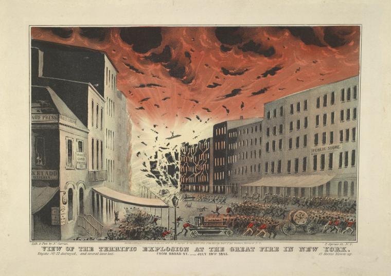
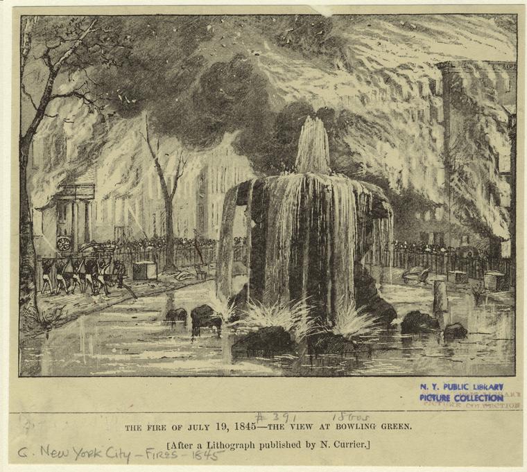
The fire was commemorated in popular prints in the 1880s, two of which currently held by the New York Public Library:

View of the terrific explosion at the Great Fire in New York. From Broad St. July 19th, 1845.


The Fire Of July 19, 1845 — The View At Bowling Green.

I came across the fire while trying to figure out the names of public health institutions in 1847 New York.  The NYC guide I’m using – Doggett’s New York City Directory – for 1845-46 contains a list of the 217 buildings destroyed by the fire, and the names of the hundreds of people who were displaced by it.

I thought it might be fun to map the extent of this fire, described in Doggett’s as:

“The disastrous fire of the 19th of July, 1845 – long to be remembered by the citizens of New-York – having laid waste a considerable portion of the business section of the city; and causing, consequently, the removal of numerous business men and firms.”

Ever systematic, the guide went on:

“The total loss by the late fire has been variously estimated at from $5,000,000 to $8,000,000.  The fire commenced about 3 o’clock, A.M. and was not subdued till 11 o’clock A.M., a period of eight hours.  Supposing, therefore, the total loss to have been $6,000,000 – the average loss per hour, was $750,000; the loss, per quarter of an hour, was $187,500; the loss, per minute, was $3,125, and the average loss per second, was $52.08 1/2!  Bank notes, of the denomination of one dollar, would not burn more rapidly in a common fireplace than was the property consumed by this conflagration.”

I have no sense of the relative value of the area destroyed today, but it encompasses much of the financial district of present-day New York City.


The Oregon Trail

I’ve recently been working on an exhibit that tracks John C. Frémont’s progress West during his Oregon Trail expeditions in 1842 and 1843. Frémont’s journal, published in The Expeditions of John Charles Fremont chronicles his progress, but gives little sense of the space covered. Similarly, the maps that were made from Frémont’s journal give an excellent sense of space, and of the Native geopolitics of the land he passed through, but give the viewer a less good sense of the time it took to traverse the space between the Missouri and Columbia rivers.

This map (powered by Omeka) is a first stab at bringing these two sources together. I have annotated the Frémont maps with excerpts from his journal, and marked every stopping point along the the trail to Oregon. I have mostly pulled out things of interest to me – Frémont took note of meteorological data  in addition to describing his progress West, and while I hope to work with that information in the future, I’ve focused here on encounters with Native peoples, and with wildlife.  Annotations that appear on the map itself are also highlighted and transcribed.

One of the things I wanted to convey with this map is the time it took to cover ground in the early nineteenth century.  Borrowing from Brenda Braithwaite’s work, “The Mechanic is the Message,”  and drawing on story maps (most notably 21 steps) I wanted the user of this map to get some sense of both the unknown ahead of Frémont and his party, and of the many stops en route to Oregon.  Put another way – I wanted to make it difficult for a user to jump ahead without pausing at every resting place that Frémont did along the Oregon trail.  To that end, the right-hand sidebar of this map contains the dates of rest stops, but future dates only become visible once you’ve clicked on the preceding ones.  The timeline at the bottom of the map is a bit of a shortcut – you can scroll forward in time and make all of the points visible – but I’m hoping that users will click through, read excerpts from Frémont’s journal, and (in an incredibly diluted way) get a sense of the experience of westward migration in the 1840s.

The spread of famine news


In two of my classes this semester – the environments seminar and the disasters methods class – I’ve been pushing students to think about what makes a good historical question, but also about what questions can be asked of different kinds of sources.  As I have a (brief, golden) respite from grading today, I thought I’d turn that question back on some of my dissertation data, and particularly what I’ve collected on incidences of famine reports around the Atlantic.  I also wanted to play with MapStory, and to hash out some ideas that I’m going to present in a more formal mode in a talk at Davidson near the end of the semester.

I started with the 6000+ entries in my famine report database, each record of which contains text from a newspaper, along with date, place of publication and the theme tags that I used to organize each chapter.  I’ve worked in the past on visualizations that show how newspapers drew on one another, but that was a static image – it didn’t capture famine reports across time and space.


Famine citations
Click for fullsize

This visualization obviously doesn’t show how these newspapers are drawing on one another, but it does tell us something quite important about how famine news is moving.  Although individual stories took weeks to cross the Atlantic, after the first reports on the crisis began to appear in American newspapers, famine reports continued to “burst” on both sides of the ocean.


Archives, architecture, data, provenance

From the Society of American Archivists:

Provenance is a fundamental principle of archives, referring to the individual, family, or organization that created or received the items in a collection. The principle of provenance or the respect des fonds dictates that records of different origins (provenance) be kept separate to preserve their context.

I once heard a (possibly apocryphal) story about an archive that required that a mummified bird that had been found in a box of documents remain there, because it was part of the original collection and consequently had to be preserved.  The story mightn’t be true, but I like it because it reminds us of a central tenet of archival management – that the original organization of things is paramount.

This comes up because I was talking about ideal sources in my (mostly) senior seminar the other day.  My students have a final paper due in the form of a proposal, for which they’ll have to include a detailed discussion of the types of sources  that will best enable them to answer their historical question, where those sources can be found, and how they’ll be used.  I asked my students to quickly describe their ideal sources – not the ones they knew exist, but the ones they hope exist.  A surprising number went straight for digitized sources they were comfortable with – the Virtual Jamestown Project, 19th century American newspapers, or the LOC’s American Memory collection.  After four years at Davidson, these students were so used to the readily available digitized sources, that they hadn’t even stopped to consider what ideal sources would look like.  In light of this self-selection, we got to talking about how digital collections are put together, and then about how physical collections are put together.  While many had used brick-and-mortar archives, and all had used digital ones, few had any idea of the information architecture of either.

The exchange convinced me that any historical methods class I teach in future must include a discussion of archival planning – of both the principles that help shape, for instance, Catherine Mulholland’s collection of her (much maligned) grandfather’s papers, and those that shape Gale’s ever expanding collections.  The former is intended to aggrandize a player in California’s water wars, the later to make sources available and to make money.  Neither of these are inherently bad, but they do shape the archives that are created.  Perhaps one of my favorite examples of the uneven development of digital archives comes from Dublin.  The major nationalist newspapers of the 19th century have long had online presences, not so much for the Unionist newspaper, which still languishes only in microfilm form in the Irish National Library, since fewer scholars, genealogists or interested novices are that interested in the musings of a paper which basically spoke for the English ascendancy in Ireland.

I love the opportunities that digital archives provide us, but I think that I also need to start explicitly teaching best practices for the creation of those archives, and spend time cultivating a critical eye towards their utility.  A student might be forgiven for, for example, focusing on sources that are readily available, but without understanding the structural conditions that underlie that availability, they miss something important about historical research and about digital culture today.

These are a few of my favorite maps

I’m putting together an aspirational syllabus for a digital humanities/mapping course, and have been thinking about my favorite maps, and why they work so well.  Here is a very-not-complete list of my current greatest hits:

Slave Revolt in Jamaica, 1760-1761: a cartographic narrative.

This is, by far, my favorite digital mapping project.  I’ve seen Vincent Brown speak on it, and I was quite impressed by his articulation of why we need a map like this to understand enslaved rebellion.  Because records of these uprisings tend to have been produced by ruling elites who were actively opposed to representing enslaved resistance as anything other than barbarous and futile, it would be easy to think that this uprising – and many others like it – were haphazard and poorly planned.  Brown’s map, on the other hand, reads the colonial archives against the grain to show us the strategy that underlay this revolt.  I love that he uses sources in which obscuring enslaved agency is a feature rather than a bug to highlight that agency.

Touring the Fire

A little less high tech, but still a great example of how a geospatial perspective can give us new, or at least different information about an historical event.  One of the persistent fictions about the Chicago fire is the culpability of Mrs. O’Leary’s cow, so it’s interesting to see how the fire spread, but also to treat the path of the fire like a walking tour, and to map it onto Chicago’s geography today.

London Soundmap

This is just ridiculously cool (and reminds me of a book I just finished about London’s underground rivers).  It borrows aesthetically from the iconic tube maps, but instead of information about subways gives us the sound of underground waterways.  There are some other great soundmaps on this site, including ambient London noise, the sound of the Thames estuary, and a handy map of the most common sounds in different parts of the city.  The whole thing is worth exploring.

While we’re talking about aural mapping…

Here’s a project which uses immigration data to create a true aural map of changes in American demography over time.

And finally, everything NOAA does, but especially their geospatial services.

Now it’s all about convincing the undergraduates that maps are cool…

Batkid, suffering strangers and distant philanthropy

Peter Singer has a great article in the Washington Post that begins with the public outpouring for Batkid, and why people are more likely to give to something like the Make-A-Wish foundation than they are to organizations that provide sleeping nets in regions with malaria, or treatment for diseases that are treatable in the United States but often deadly elsewhere, before turning to the United States’ complicity in global poverty:

People who get money as a gift are likely to be more willing to give it away than those who do not receive this unexpected bounty. Nevertheless, the “giving experiment” shows not only that many Americans would like to help the global poor but also that they are genuinely happy to do so. All they need is the knowledge to be able to do so effectively.

I’ll leave others to take on this last point – though I think that structural poverty and inequality are an outcome of reduced foreign spending by the U.S. government, I imagine most Americans would balk at being accused of desiring global poverty (and I think that making the link between the one and the other was one of the central points of this article.)

But, I was more interested in an earlier claim, that

The answer [to why we focus on Batkid rather than helping unknown multitudes] lies, at least in part, in those above-mentioned emotions, which, as psychological research shows, make the plight of a single identifiable individual much more salient to us than that of a large number of people we cannot identify.

and

[T]he unknown and unknowable children who will be infected with malaria without bed nets just don’t grab our emotions like the kid with leukemia we can watch on TV. That is a flaw in our emotional make-up, one that developed over millions of years when we could help only people we could see in front of us. It is not justification for ignoring the needs of distant strangers.

Rhetorically, I absolutely agree with him.  It’s easier to make a case about the utility of a donation when you focus on one story rather than generalities – and studies bear this out.  I’m not as convinced that we can axiomatically make the jump from particular > general to proximate > far.  In the nineteenth century, I’ve found that distant philanthropy was very attractive precisely because donors could imagine the best results of their donations.  (It also had a lot – and I think more – to do with the ways in which distant philanthropy was more suited to political framing.  It’s much easier to say that the Irish famine is really about the abuse of centralized power, and therefore a good paralell for the Wilmot Proviso, for example, when the donors – in this case, Southern slave owners – were removed from the particularities of the crisis by several thousand miles)  But I don’t see this as a fundamental “flaw in our emotional makeup” – a phrase which suggests that people (in Singer’s case, Americans) are unable to imagine, or even appropriate the suffering of distant strangers.  A long history of international and institutional philanthropy undermines his somewhat absolute claim.  In the case that I study, thousands of people with no connection to Ireland gave over one million dollars.  The same can be said of other nineteenth-century causes, and with the advent of the Red Cross in the late nineteenth century, donors weren’t even giving to a particular set of suffering strangers, but to the relief of distant victims broadly.

So if not from the research, and not from the history of philanthropy, from where does Singer’s conflation of distance and particularity come?  He uses two examples from NPR callers, one woman who refused to donate money to overseas causes, because she couldn’t be sure her money would help someone, and another whose experiences in Haiti prompted her to give because she had been able to see exactly how far very small (for most Americans) donations would go.  This seems less about distance to me than it does about the specific versus the general (this whole topic is also informed by how Americans value the lives of different people, a determination often inflected by race, gender and class), but I was also struck by the fact that I have never come across a famine donor anxious about how their money was being spent.  Some of the people who gave to Irish famine relief also gave to help the Irish Revolution of 1848, and many of those donors wrote frequently and at great length about their hopes that money would go to particular people or aims (guns vs. revolutionary literature, for example) – but in the case of famine fundraising, which began in 1845 and continued into 1852, I have not found a single instance of anxiety about fraud.  And while some appeals told stories of individual sufferers, most appeals for Irish aid describe misery in very general terms – emphasizing the extent of distress and widespread scarcity rather than the fact that a donation could save one Irish child.

Certainly, philanthropy has changed between the nineteenth century and today, but I’m struck by the fact that the kind of proximate, paternalist charity that Singer says is – and always has been – the philanthropic norm, was absolutely typical of late eighteenth- and early nineteenth-century charity, but was radically disrupted by market, print and transportation revolutions of the mid-nineteenth century.
A new (to me) take on paternalism and acculturation

Another gem from the Philadelphia yearly meeting, on why Quakers were invested in Indian welfare:

“While endavouring amid many obstacles, to discharge the duties which devolve upon them, the Committee are at times encouraged by the belief, that this interesting concern, which for half a century has engaged the attention of the yearly meetings, originated in a sense of religious duty towards these poor oppressed people; and that however little may seem to have been accomplished in proportion to the time and means expended it is but discharging a debt of gratitude and love, due to the descendants of those who showed kindness to our forefathers when they were few in number and strangers in the wilderness; and that an obligation still rests upon us to lend our sympathies and our aid to them, now they have become a feeble remnant in the midst of a great nation, unable to shield themselves from the grasp of the oppressor.”

More bureaucracy

Perhaps it’s just that reading organizational records means more bureaucracy than I’m generally used to, but I’ve been intrigued by entries in the monthly meeting minutes of the Philadelphia Society of Friends that report on general levels of attendance at meetings throughout the week.  I’ve just moved on to the yearly meeting, and found that those reports were aggregated, with the conclusion “The hour is generally well observed.  All the meetings notice instances of sleeping, but in other respects little unbecoming behavior.”